Walkthrough#
Learning Objectives#
At the end of this learning activity you will be able to:
Create barplots of categorical count data.
Adjust the limits, labels, and titles of matplotlib axes.
Create boxplots of continious numerical data.
Generate histograms of continious numerical data.
Construct scatterplots to compare continious variables.
import numpy as np
import pandas as pd

# A common import style you'll see across the web
import matplotlib.pyplot as plt

# Make the notebook show images as we make them
%matplotlib inline
Matplotlib#
Matplotlib is a highly influential plotting library in Python dating back to the early 2000s. It was initially created by John D. Hunter, a neurobiologist, as an alternative to MATLAB, which was widely used at the time for scientific computing and data visualization. His primary motivation was to have an open-source tool that could replicate MATLAB’s plotting capabilities, which he needed for his work in electrophysiology. Over the years, it has grown with contributions from a large community of developers, evolving to support a wide range of plots and visualizations.
A key to Matplotlib’s success is been its flexibility and integration with other Python libraries. It works well with NumPy and Pandas, making it a go-to choice for data analysis and manipulation tasks. Its integration with Jupyter notebooks has also made it popular for exploratory data analysis in a notebook environment.
Matplotlib’s design philosophy revolves around the idea of allowing users to create simple plots with just a few lines of code, while also giving them the ability to make complex customizations. This balance between simplicity and power has contributed significantly to its widespread adoption.
If you are interested, you can read more about the history of the package at their website.
Data#
This week we will look at data from a cohort of People Living with HIV (PLH) here at Drexel.
As we discussed in the introduction, this data collection effort was done to provide a resource for many projects across the fields of HIV, aging, inflammation, neurocognitive impairment, immune function, and unknowable future projects. In this walkthrough we will explore a collection of cytokines and chemokines measured by a Luminex panel of common biomarkers of inflammation.
data = pd.read_csv('cytokine_data.csv')
data.head()
| Sex | Age | isAA | egf | eotaxin | fgfbasic | gcsf | gmcsf | hgf | ifnalpha | ... | mig | mip1alpha | mip1beta | tnfalpha | vegf | cocaine_use | cannabinoid_use | neuro_screen_impairment_level | bmi | years_infected | |
|---|---|---|---|---|---|---|---|---|---|---|---|---|---|---|---|---|---|---|---|---|---|
| 0 | Male | 53.0 | Checked | 65.01 | 170.20 | 50.32 | 117.14 | 2.51 | 481.37 | 110.79 | ... | 185.29 | 104.63 | 151.15 | 17.61 | 7.54 | True | True | none | 21 | 18 |
| 1 | Female | 62.0 | Checked | 232.83 | 118.23 | 36.03 | 215.38 | 24.53 | 988.71 | 66.13 | ... | 397.24 | 242.10 | 230.87 | 51.22 | 31.60 | True | True | none | 22 | 16 |
| 2 | Male | 60.0 | Checked | 84.84 | 55.27 | 13.22 | 14.08 | 0.48 | 364.31 | 78.67 | ... | 18.63 | 34.85 | 68.34 | 2.48 | 0.84 | False | False | none | 25 | 16 |
| 3 | Male | 62.0 | Checked | 24.13 | 70.18 | 4.12 | 14.08 | 1.33 | 510.36 | 118.64 | ... | 118.63 | 113.30 | 49.15 | 10.93 | 3.53 | True | True | impaired | 29 | 21 |
| 4 | Male | 54.0 | Checked | 186.98 | 69.18 | 32.56 | 184.74 | 12.55 | 395.87 | 40.79 | ... | 140.56 | 131.83 | 241.00 | 32.01 | 10.81 | True | True | none | 26 | 16 |
5 rows × 37 columns
Basic Plotting#
pandas and matplotlib are tightly coupled and provide a number of ways to make simple plots easily.
Most pandas objects have .plot() method that can graph the data within it and control many of the outputs.
Columns (or any pd.Series object) have a method for easily counting categorical values:
.value_counts()
data['Sex'].value_counts()
Sex
Male           140
Female          82
Transgender      2
Name: count, dtype: int64
# Just plot it.

data['Sex'].value_counts().plot()
<Axes: xlabel='Sex'>
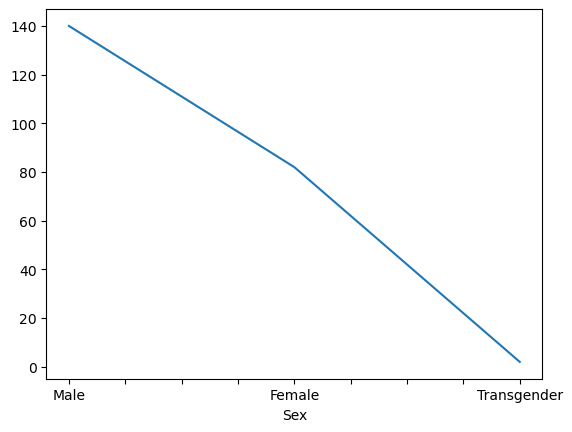
That’s almost what we want.
By default, the kind of plot is a line-plot, because it was originally designed for time-series financial data.
Nicely, pandas allows many different ways to customize a plot.
One of which, is to change its kind, we can change that like so.
data['Sex'].value_counts().plot(kind = 'bar')
<Axes: xlabel='Sex'>
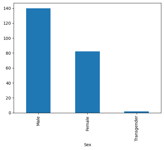
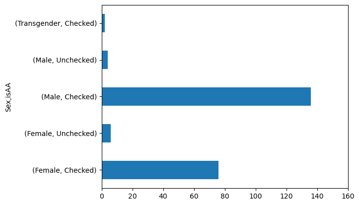
Like we learned last week, grouping samples by categories can be insightful. What if we wanted to know whether there was a balance of racial minorities across our gender categories?
To do this, you can use groupby to create multiple levels.
data.groupby('Sex')['isAA'].value_counts()
Sex          isAA
Female       Checked       76
             Unchecked      6
Male         Checked      136
             Unchecked      4
Transgender  Checked        2
Name: count, dtype: int64
# Notice kind='barh' to make it horizontal

data.groupby('Sex')['isAA'].value_counts().plot(kind = 'barh')
<Axes: ylabel='Sex,isAA'>
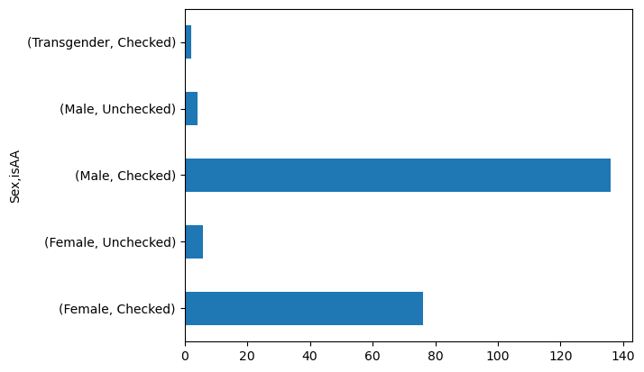
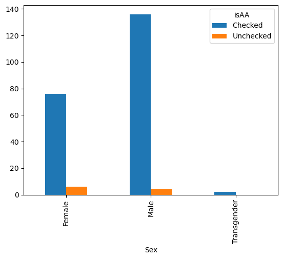
We can also pivot the data such that we have a table with a column for each isAA.
gender_race_piv = pd.pivot_table(data,
                                 index = 'Sex',
                                 columns = 'isAA',
                                 values = 'Age', # Can be any column, we're just counting them
                                 aggfunc = 'count')
gender_race_piv
| isAA | Checked | Unchecked |
|---|---|---|
| Sex | ||
| Female | 76.0 | 6.0 |
| Male | 136.0 | 4.0 |
| Transgender | 2.0 | NaN |
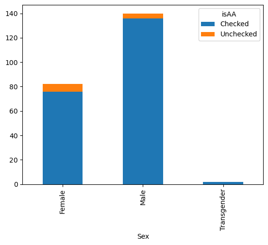
Then, it will plot each column as a different bar.
gender_race_piv.plot(kind = 'bar')
<Axes: xlabel='Sex'>
gender_race_piv.plot(kind = 'bar', stacked=True)
<Axes: xlabel='Sex'>
There are dozens of things you can customize about your plots in this manner.
You can see them either by checking the help here in Colab.
To do this, run data.plot? in a cell by itself, and Colab will bring up some information to read.
You can also check out the documentation on the pandas website here and in their tutorial here.
Plot Handles#
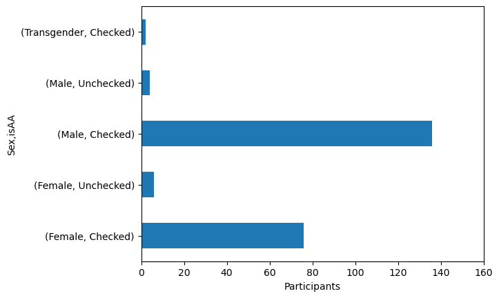
If we want to make edits to the plot, we need to capture the handle that is generated by the plot.
This variable represents the object of the plot and allows us to manipulate its properties like the axis limits, labels, etc.
This must be done in the same cell before the image is presented.
axis_handle = data.groupby('Sex')['isAA'].value_counts().plot(kind = 'barh')
axis_handle.set_xlim(0, 160)
(0.0, 160.0)
axis_handle = data.groupby('Sex')['isAA'].value_counts().plot(kind = 'barh')
axis_handle.set_xlim(0, 160)
axis_handle.set_xlabel('Participants')
Text(0.5, 0, 'Participants')
Q1: Explore the cocaine_use and cannabinoid_use columns.#
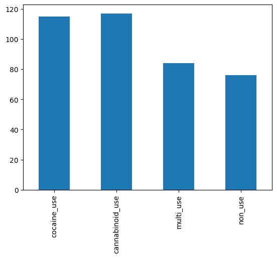
Create a barplot of the number of cocaine, cannabinoid, multi-use, and non-use.
# Add a new column indicating True for multi-use

data['multi_use'] = data['cocaine_use'] & data['cannabinoid_use'] # SOLUTION

# Add a new column indicating True for non-use
data['non_use'] = (data['cocaine_use'] | data['cannabinoid_use']) == False # SOLUTION
# Sum the number of True's in each use column

use_counts = data[['cocaine_use', 'cannabinoid_use', 'multi_use', 'non_use']].sum() # SOLUTION
use_counts
cocaine_use        115
cannabinoid_use    117
multi_use           84
non_use             76
dtype: int64
# Create a barplot
use_axis = use_counts.plot(kind='bar') # SOLUTION
grader.check("q1_drug_use_plot")
Numeric Variables#
We can summarize numerical columns in a number of ways.
Box Plots#
data['Age'].plot(kind = 'box')
<Axes: >
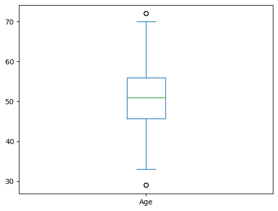
Breaking it down:
The middle green line is the mean
The box represents the 25-75 quartiles
The whiskers represent the 95% confidence interval
The dots are outliers outside the 95% CI.
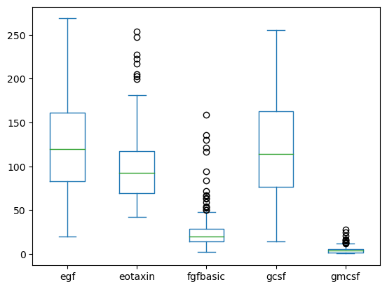
You can do multiple box plots if your data is in wide form.
data[['egf', 'eotaxin', 'fgfbasic', 'gcsf', 'gmcsf']].plot(kind='box')
<Axes: >
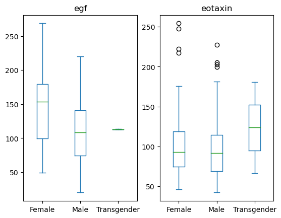
You can also group by another column to create subplots.
data[['Sex', 'egf', 'eotaxin']].plot(kind='box', by = 'Sex')
egf           Axes(0.125,0.11;0.352273x0.77)
eotaxin    Axes(0.547727,0.11;0.352273x0.77)
dtype: object
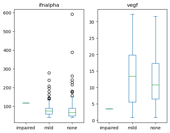
Q2: Is the expression of infalpha or vegf different across neurological impairment status?#
Create a set of boxplots to visualize the infalpha or vegf at different neurological states in the neuro_screen_impairment_level column.
cols = ['neuro_screen_impairment_level', 'vegf', 'ifnalpha'] # SOLUTION NO PROMPT
q2_axes = data[cols].plot(kind='box', by = 'neuro_screen_impairment_level') # SOLUTION
grader.check("q2_neuro_use_plot")
# DO NOT REMOVE!
plt.close()
# For the grader
Histograms#
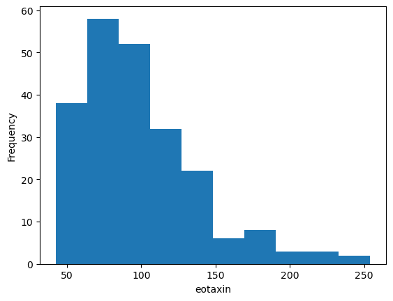
data['eotaxin'].plot(kind = 'hist')
<Axes: ylabel='Frequency'>
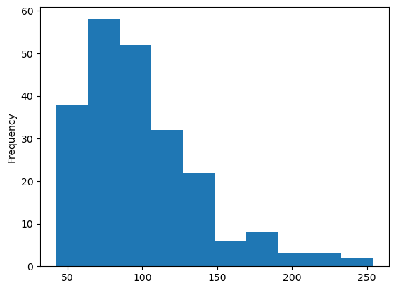
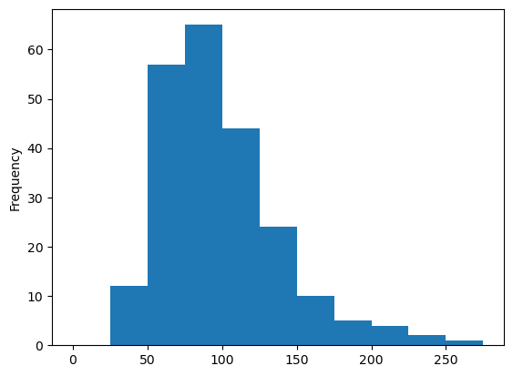
Personally, I prefer to specify my bin edges explicitly instead of letting the computer decide.
data['eotaxin'].plot(kind = 'hist',
                     bins = np.arange(0, 300, 25))
<Axes: ylabel='Frequency'>
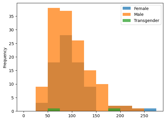
data.groupby('Sex')['eotaxin'].plot(kind = 'hist',
                                    bins = np.arange(0, 300, 25),
                                    alpha = 0.75,
                                    legend=True)
Sex
Female         Axes(0.125,0.11;0.775x0.77)
Male           Axes(0.125,0.11;0.775x0.77)
Transgender    Axes(0.125,0.11;0.775x0.77)
Name: eotaxin, dtype: object
Comparison of Variables#
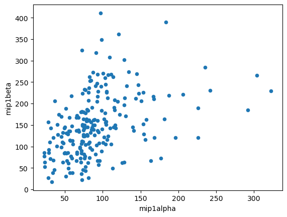
data.plot(kind = 'scatter', x = 'mip1alpha', y = 'mip1beta')
<Axes: xlabel='mip1alpha', ylabel='mip1beta'>
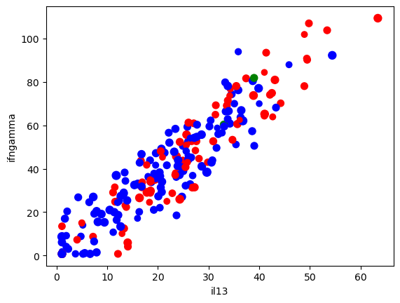
# We can also add colors
colors = data['Sex'].replace({'Male': 'b', 'Female': 'r', 'Transgender': 'g'})

ax = data.plot(kind = 'scatter', x = 'il13', y = 'ifngamma',
               s = 'Age', # Make the size proportional to age
               c = colors
          )
One can also make a GIANT matrix of different comparisons.
# It is helpful to pick columns first to prevent a figure explosion
cols = ['Age', 'gcsf', 'gmcsf',
       'ifnalpha', 'ifngamma', 'il10', 'il12', 'il13', 'il15', 'il17',
       'il1beta', 'il2', 'il2r', 'il4', 'il5', 'il6', 'il7', 'il8', 'ilra']

pd.plotting.scatter_matrix(data[cols], figsize=(10, 10));
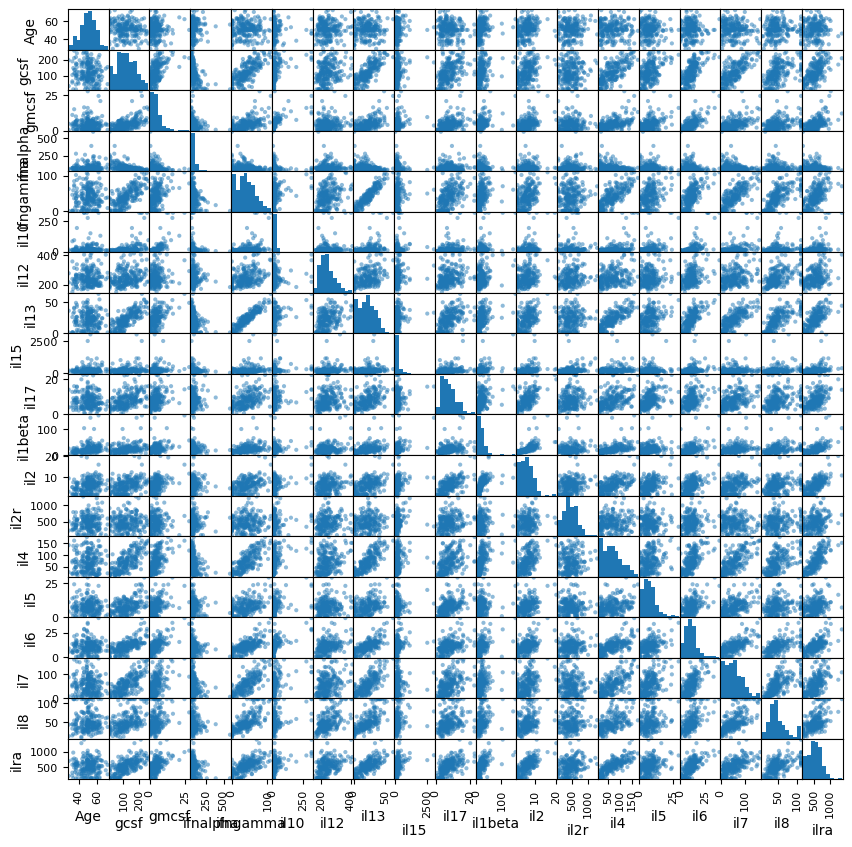
We can also get a numeric summary of these correlations.
Method:
method = 'pearson'- Pearson’s correlation is ideal for continuous variables that have a linear relationship and are normally distributed.method = 'kendall'- Kendall’s tau is suitable for ordinal data or when dealing with non-linear relationships, especially in small samples or when data contains ties.method = 'spearman'- Spearman’s rank is best used with ordinal or non-normal data to assess monotonic relationships, being robust to outliers.
cross_corr = data[cols].corr(method = 'pearson')

# Using .style we can create a visually accented table
cross_corr.style.background_gradient(cmap='RdBu', vmin=-1, vmax=1)
| Age | gcsf | gmcsf | ifnalpha | ifngamma | il10 | il12 | il13 | il15 | il17 | il1beta | il2 | il2r | il4 | il5 | il6 | il7 | il8 | ilra | |
|---|---|---|---|---|---|---|---|---|---|---|---|---|---|---|---|---|---|---|---|
| Age | 1.000000 | -0.138601 | 0.025381 | 0.151691 | 0.028367 | -0.020368 | 0.054970 | 0.037198 | 0.091752 | -0.068860 | 0.267359 | 0.246212 | 0.093771 | 0.010019 | -0.061873 | 0.026794 | -0.078327 | 0.002176 | 0.008464 |
| gcsf | -0.138601 | 1.000000 | 0.557713 | -0.482685 | 0.750044 | 0.436466 | 0.260339 | 0.802374 | 0.241813 | 0.478915 | 0.314062 | 0.420381 | 0.081597 | 0.729213 | 0.505447 | 0.677255 | 0.736280 | 0.531052 | 0.665777 |
| gmcsf | 0.025381 | 0.557713 | 1.000000 | -0.243742 | 0.494296 | 0.664964 | 0.148070 | 0.572021 | 0.193861 | 0.391024 | 0.445546 | 0.469479 | 0.043457 | 0.562916 | 0.448692 | 0.717995 | 0.512550 | 0.371020 | 0.573143 |
| ifnalpha | 0.151691 | -0.482685 | -0.243742 | 1.000000 | -0.310915 | -0.166206 | -0.033597 | -0.357502 | -0.087955 | 0.028181 | -0.040962 | 0.073912 | 0.013190 | -0.315913 | -0.087407 | -0.236207 | -0.288627 | -0.210411 | -0.263505 |
| ifngamma | 0.028367 | 0.750044 | 0.494296 | -0.310915 | 1.000000 | 0.375722 | 0.368554 | 0.933985 | 0.181085 | 0.492297 | 0.412781 | 0.479059 | 0.101155 | 0.779431 | 0.451532 | 0.692426 | 0.782223 | 0.719207 | 0.669997 |
| il10 | -0.020368 | 0.436466 | 0.664964 | -0.166206 | 0.375722 | 1.000000 | 0.170408 | 0.403432 | 0.140076 | 0.280245 | 0.457242 | 0.389750 | 0.097774 | 0.442361 | 0.385806 | 0.620481 | 0.439171 | 0.300991 | 0.444492 |
| il12 | 0.054970 | 0.260339 | 0.148070 | -0.033597 | 0.368554 | 0.170408 | 1.000000 | 0.398808 | 0.197413 | 0.260844 | 0.300701 | 0.244419 | 0.115518 | 0.314940 | 0.132016 | 0.427060 | 0.354507 | 0.485122 | 0.428603 |
| il13 | 0.037198 | 0.802374 | 0.572021 | -0.357502 | 0.933985 | 0.403432 | 0.398808 | 1.000000 | 0.202042 | 0.531708 | 0.442948 | 0.503528 | 0.159311 | 0.809495 | 0.418689 | 0.737718 | 0.764736 | 0.717813 | 0.747175 |
| il15 | 0.091752 | 0.241813 | 0.193861 | -0.087955 | 0.181085 | 0.140076 | 0.197413 | 0.202042 | 1.000000 | 0.248006 | 0.466990 | 0.325552 | 0.211610 | 0.209317 | 0.150825 | 0.265412 | 0.076294 | 0.177314 | 0.359000 |
| il17 | -0.068860 | 0.478915 | 0.391024 | 0.028181 | 0.492297 | 0.280245 | 0.260844 | 0.531708 | 0.248006 | 1.000000 | 0.353137 | 0.656041 | 0.229345 | 0.467742 | 0.520928 | 0.451760 | 0.466016 | 0.302081 | 0.594334 |
| il1beta | 0.267359 | 0.314062 | 0.445546 | -0.040962 | 0.412781 | 0.457242 | 0.300701 | 0.442948 | 0.466990 | 0.353137 | 1.000000 | 0.638172 | 0.123453 | 0.490802 | 0.221033 | 0.453011 | 0.380507 | 0.385047 | 0.582153 |
| il2 | 0.246212 | 0.420381 | 0.469479 | 0.073912 | 0.479059 | 0.389750 | 0.244419 | 0.503528 | 0.325552 | 0.656041 | 0.638172 | 1.000000 | 0.223827 | 0.605978 | 0.448138 | 0.544815 | 0.426076 | 0.334738 | 0.718436 |
| il2r | 0.093771 | 0.081597 | 0.043457 | 0.013190 | 0.101155 | 0.097774 | 0.115518 | 0.159311 | 0.211610 | 0.229345 | 0.123453 | 0.223827 | 1.000000 | 0.085262 | 0.003752 | 0.207338 | -0.066149 | 0.127249 | 0.298616 |
| il4 | 0.010019 | 0.729213 | 0.562916 | -0.315913 | 0.779431 | 0.442361 | 0.314940 | 0.809495 | 0.209317 | 0.467742 | 0.490802 | 0.605978 | 0.085262 | 1.000000 | 0.336091 | 0.669285 | 0.711649 | 0.600322 | 0.809062 |
| il5 | -0.061873 | 0.505447 | 0.448692 | -0.087407 | 0.451532 | 0.385806 | 0.132016 | 0.418689 | 0.150825 | 0.520928 | 0.221033 | 0.448138 | 0.003752 | 0.336091 | 1.000000 | 0.491866 | 0.511682 | 0.249805 | 0.351729 |
| il6 | 0.026794 | 0.677255 | 0.717995 | -0.236207 | 0.692426 | 0.620481 | 0.427060 | 0.737718 | 0.265412 | 0.451760 | 0.453011 | 0.544815 | 0.207338 | 0.669285 | 0.491866 | 1.000000 | 0.689055 | 0.601472 | 0.688109 |
| il7 | -0.078327 | 0.736280 | 0.512550 | -0.288627 | 0.782223 | 0.439171 | 0.354507 | 0.764736 | 0.076294 | 0.466016 | 0.380507 | 0.426076 | -0.066149 | 0.711649 | 0.511682 | 0.689055 | 1.000000 | 0.638858 | 0.606169 |
| il8 | 0.002176 | 0.531052 | 0.371020 | -0.210411 | 0.719207 | 0.300991 | 0.485122 | 0.717813 | 0.177314 | 0.302081 | 0.385047 | 0.334738 | 0.127249 | 0.600322 | 0.249805 | 0.601472 | 0.638858 | 1.000000 | 0.556885 |
| ilra | 0.008464 | 0.665777 | 0.573143 | -0.263505 | 0.669997 | 0.444492 | 0.428603 | 0.747175 | 0.359000 | 0.594334 | 0.582153 | 0.718436 | 0.298616 | 0.809062 | 0.351729 | 0.688109 | 0.606169 | 0.556885 | 1.000000 |
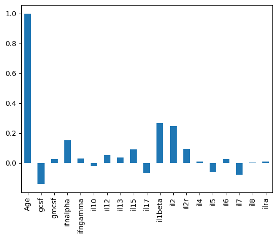
cross_corr is just a DataFrame, which means we can extract columns.
# How does each cytokine correlate with Age?

cross_corr['Age'].plot(kind='bar')
<Axes: >
These excercises should provide a basic set of plotting tools to visualize tabular data.
In the next week we’ll explore more advanced ‘statistical plotting’ with the seaborn library.
This will add additional features like better faceting across groups, confidence intervals through bootstrapping, better legends, and more control to our plots.
In future weeks we’ll also explore how to assess statistical significance across groups and strategies for finding correlated parameters.
Matplotlib Gotchas#

While Matplotlib is great, it is sometimes incredibly frustrating. Here’s a handful of common rakes that I run across.
How do you get plots out of here?
# Make the plot and grab the axis object

ax = data['eotaxin'].plot(kind = 'hist')

ax.set_xlabel('eotaxin')

# Get the Figure handle this axis is on
fig = ax.figure


# Save the figure
fig.savefig('eotaxin_hist.png', # Can be any extension, but you probably want PNGs
            dpi = 50 # Good quality for viewing and debugging, use 300 for publications
            )
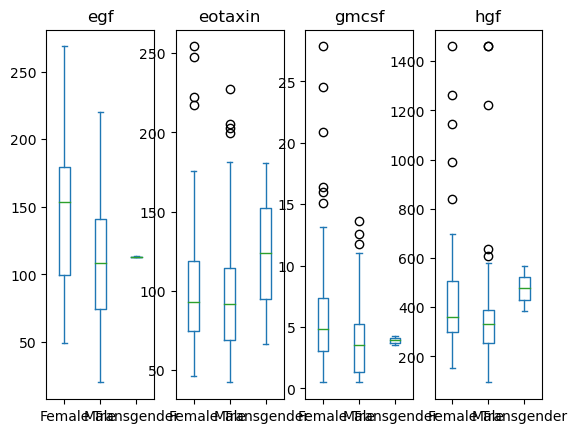
Overlapping labels.
data[['Sex', 'egf', 'eotaxin', 'hgf', 'gmcsf']].plot(kind='box', by = 'Sex')
egf           Axes(0.125,0.11;0.168478x0.77)
eotaxin    Axes(0.327174,0.11;0.168478x0.77)
gmcsf      Axes(0.529348,0.11;0.168478x0.77)
hgf        Axes(0.731522,0.11;0.168478x0.77)
dtype: object
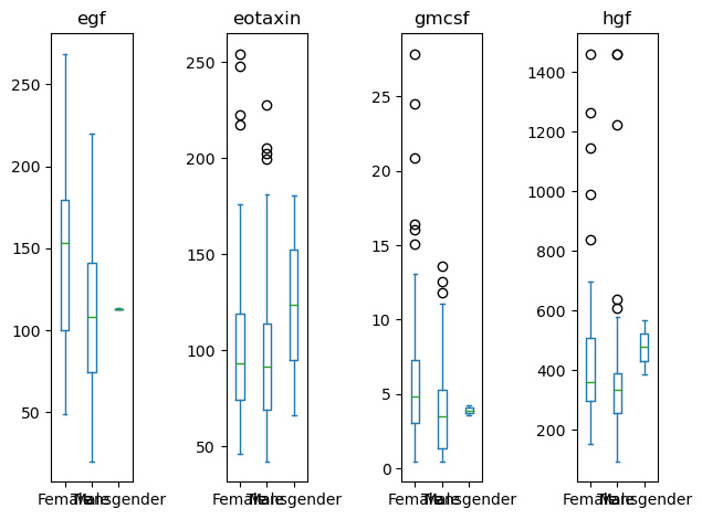
# Grab the series of axis objects
ax_ser = data[['Sex', 'egf', 'eotaxin', 'hgf', 'gmcsf']].plot(kind='box', by = 'Sex')

# Somehow get the figure object
fig = ax_ser.iloc[0].figure

# Re-layout the figure
fig.tight_layout()
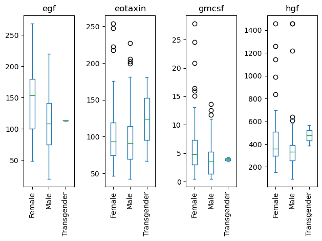
Rotating labels.
# Grab the series of axis objects
ax_ser = data[['Sex', 'egf', 'eotaxin', 'hgf', 'gmcsf']].plot(kind='box', by = 'Sex')

# Somehow get the figure object
fig = ax_ser.iloc[0].figure

# Create a function that fixes each axis
# lambda ax: ax.tick_params(axis='x', labelrotation=90)

# Apply that function across all axes BEFORE the re-layout
ax_ser.map(lambda ax: ax.tick_params(axis='x', labelrotation=90))

# Re-layout the figure
fig.tight_layout()
