Walkthrough#
Learning Objectives#
At the end of this learning activity you will be able to:
Create categorical comparisons with countplots.
Create quantitative comparison plots with seaborn: stripplot, barplot, boxplot with Seaborn.
Create correlation style plots with with scatterplot and regplot.
Utilize
pd.meltto plot wide data with seaborn.Describe bootstapping and confidence intervals.
This week we will continue our exploration of data from a cohort study participants of People Living with HIV (PLwH) here at Drexel.
As we discussed in the introduction, this data collection effort was done to provide a resource for many projects across the fields of HIV, aging, inflammation, neurocognitive impairment, immune function, and unknowable future projects. In this walkthrough we will explore a collection of cytokines and chemokines measured by a Luminex panel of common biomarkers of inflammation. We use this data to look for correlations between cytokine biomarkers and demographic variables.
Documentation#
I HIGHLY recommend exploring and utilizing the documentation for this tool:
Gallery of great examples: https://seaborn.pydata.org/examples/index.html
Function documentation: (We will be using the Function Interface. https://seaborn.pydata.org/api.html#function-interface
Tutorial: https://seaborn.pydata.org/tutorial.html
When I’m making figures I’ll usually have the documentation open on another tab.
import numpy as np
import pandas as pd
import matplotlib.pyplot as plt

# This is how we normally import seaborn
import seaborn as sns

%matplotlib inline
data = pd.read_csv('cytokine_data.csv')
data.head()
| Sex | Age | isAA | egf | eotaxin | fgfbasic | gcsf | gmcsf | hgf | ifnalpha | ... | mig | mip1alpha | mip1beta | tnfalpha | vegf | cocaine_use | cannabinoid_use | neuro_screen_impairment_level | bmi | years_infected | |
|---|---|---|---|---|---|---|---|---|---|---|---|---|---|---|---|---|---|---|---|---|---|
| 0 | Male | 53.0 | Checked | 65.01 | 170.20 | 50.32 | 117.14 | 2.51 | 481.37 | 110.79 | ... | 185.29 | 104.63 | 151.15 | 17.61 | 7.54 | True | True | none | 21 | 18 |
| 1 | Female | 62.0 | Checked | 232.83 | 118.23 | 36.03 | 215.38 | 24.53 | 988.71 | 66.13 | ... | 397.24 | 242.10 | 230.87 | 51.22 | 31.60 | True | True | none | 22 | 16 |
| 2 | Male | 60.0 | Checked | 84.84 | 55.27 | 13.22 | 14.08 | 0.48 | 364.31 | 78.67 | ... | 18.63 | 34.85 | 68.34 | 2.48 | 0.84 | False | False | none | 25 | 16 |
| 3 | Male | 62.0 | Checked | 24.13 | 70.18 | 4.12 | 14.08 | 1.33 | 510.36 | 118.64 | ... | 118.63 | 113.30 | 49.15 | 10.93 | 3.53 | True | True | impaired | 29 | 21 |
| 4 | Male | 54.0 | Checked | 186.98 | 69.18 | 32.56 | 184.74 | 12.55 | 395.87 | 40.79 | ... | 140.56 | 131.83 | 241.00 | 32.01 | 10.81 | True | True | none | 26 | 16 |
5 rows × 37 columns
Categorical Comparisons#
Counting with countplot#
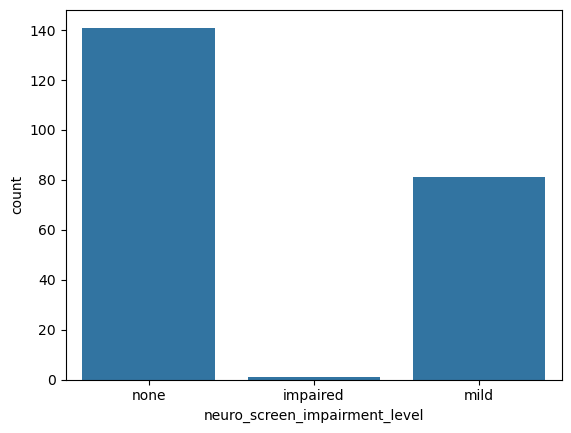
sns.countplot(data = data, # Pass the Dataframe `data` into the kwarg `data`
              x = 'neuro_screen_impairment_level')
<Axes: xlabel='neuro_screen_impairment_level', ylabel='count'>
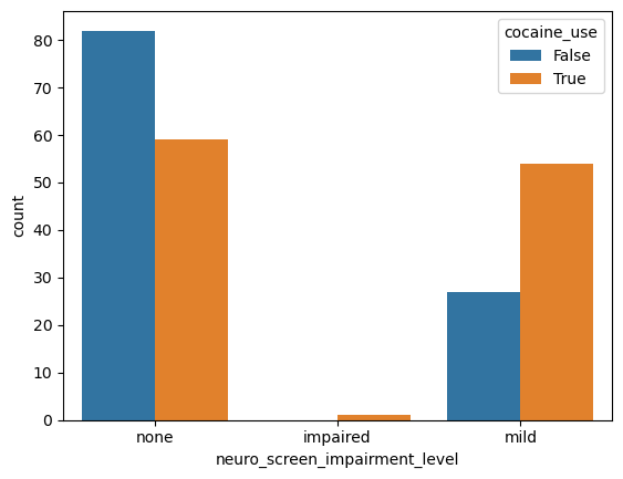
sns.countplot(data = data, # Pass the Dataframe `data` into the kwarg `data`
              x = 'neuro_screen_impairment_level',
              hue = 'cocaine_use')
<Axes: xlabel='neuro_screen_impairment_level', ylabel='count'>
If we wanted to look at multiple columns. It would be wonderful if we could do this:
# This doesn't work

# sns.countplot(data = data,
#               x = 'neuro_screen_impairment_level',
#               hue = ['cocaine_use', 'cannabinoid_use'])
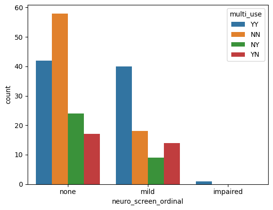
But, we can create a new column that is the combination of the two:
def use_desc(row):
    cocaine = 'Y' if row['cocaine_use'] else 'N'
    cannabinoid = 'Y' if row['cannabinoid_use'] else 'N'
    return cocaine+cannabinoid

data['multi_use'] = data.apply(use_desc, axis=1)
While we’re doing transformations, let’s improve our plots by converting our neuro_screen_impairment_level to a proper ordinal variable.
Categorical variables : A set of distinct and seperable groups.
Ordinal variables : A set of distinct and seperable groups with a sortable order.
By default, pandas treats all strings as categorical and it sorts them alphabetically.
But sometimes, we want to specify a order. We can do that like so.
pd.Categorical(data['neuro_screen_impairment_level'],
               categories = ['none', 'mild', 'impaired'], ordered=True)
['none', 'none', 'none', 'impaired', 'none', ..., 'none', 'mild', 'mild', 'mild', 'mild']
Length: 224
Categories (3, object): ['none' < 'mild' < 'impaired']
data['neuro_screen_ordinal'] = pd.Categorical(data['neuro_screen_impairment_level'],
                                               categories = ['none', 'mild', 'impaired'], ordered=True)
sns.countplot(data = data, # Pass the Dataframe `data` into the kwarg `data`
              x = 'neuro_screen_ordinal', # Seaborn will respect the ordering of our categories.
              hue = 'multi_use')
<Axes: xlabel='neuro_screen_ordinal', ylabel='count'>
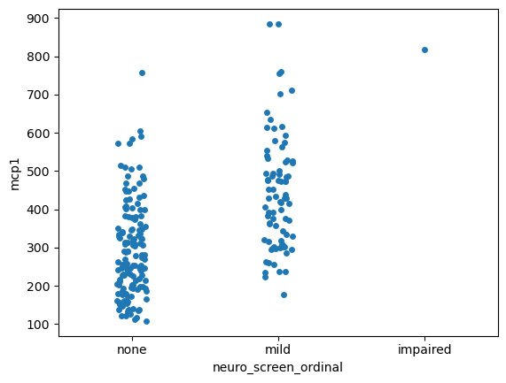
Visualizing differences across categories with stripplot#
sns.stripplot(data = data,
              x = 'neuro_screen_ordinal',
              y = 'mcp1')
<Axes: xlabel='neuro_screen_ordinal', ylabel='mcp1'>
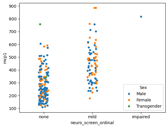
sns.stripplot(data = data,
              x = 'neuro_screen_ordinal',
              hue = 'Sex',
              y = 'mcp1')
# Try dodge = True
<Axes: xlabel='neuro_screen_ordinal', ylabel='mcp1'>
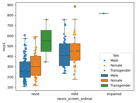
You can even put plots on top of plots!
# Grab the axis object that was created
ax = sns.stripplot(data = data,
                   x = 'neuro_screen_ordinal',
                   hue = 'Sex',
                   y = 'mcp1',
                   dodge = True)


sns.boxplot(data = data,
              x = 'neuro_screen_ordinal',
              hue = 'Sex',
              y = 'mcp1',
              ax = ax) # Give that axis to the next plot
<Axes: xlabel='neuro_screen_ordinal', ylabel='mcp1'>
Quantifying the uncertainty of estimates#
When presenting data it is important to rigorously convey the precision and uncertainty of our estimates. I HIGHLY recommend reading the error bar tutorial in seaborn. Below is a quick summary.
The error bars around an estimate of central tendency can show one of two general things: either the range of uncertainty about the estimate or the spread of the underlying data around it. These measures are related: given the same sample size, estimates will be more uncertain when data has a broader spread. But uncertainty will decrease as sample sizes grow, whereas spread will not.
Value Spread: How much each value differs from every other value
Standard deviation: Average difference of each point from the mean.
Percentile Interval: Middle range that contains some percent of the data.
Estimate Uncertainty: What is the reasonable range of my estimate
Standard Error: Standard deviation/sqrt(sample_size)
Confidence Intervals:
The nonparametric approach to representing uncertainty uses bootstrapping: a procedure where the dataset is randomly resampled with replacement a number of times, and the estimate is recalculated from each resample. This procedure creates a distribution of statistics approximating the distribution of values that you could have gotten for your estimate if you had a different sample.
Measuring Spread#
Quantifies how much each individual measurement vary around the middle.
# Parametric Assumptions

fig, (par_ax, np_ax) = plt.subplots(1, 2, figsize=(8, 4), sharey=True)

## Plot with parametric assumpitions
sns.barplot(data = data,
            x = 'neuro_screen_ordinal',
            y = 'mcp1',
            estimator = 'mean',
            errorbar = ('sd', 2),
                ax = par_ax) # 95% CI

sns.stripplot(data = data,
              x = 'neuro_screen_ordinal',
              y = 'mcp1',
              alpha=0.5,
              ax=par_ax)
par_ax.set_title('Parametric')

## Plot with non-parametric methods

## Plot with parametric assumpitions
sns.barplot(data = data,
            x = 'neuro_screen_ordinal',
            y = 'mcp1',
            estimator = 'median',
            errorbar = ('pi', 95),
                ax = np_ax) # 95% CI

sns.stripplot(data = data,
              x = 'neuro_screen_ordinal',
              y = 'mcp1',
              alpha=0.5,
              ax=np_ax)

np_ax.set_title('Non-Parametric')

fig.tight_layout()
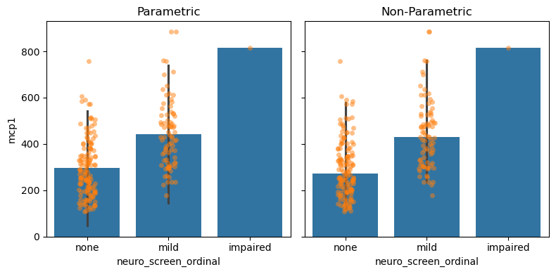
Measuring Uncertainty#
Quantifies how confident we are about where the middle of the distribution is.
# Parametric Assumptions

fig, (par_ax, np_ax) = plt.subplots(1, 2, figsize=(8, 4), sharey=True)

## Plot with parametric assumpitions
sns.barplot(data = data,
            x = 'neuro_screen_ordinal',
            y = 'mcp1',
            estimator = 'mean',
            errorbar = ('se', 2),
                ax = par_ax)

sns.stripplot(data = data,
              x = 'neuro_screen_ordinal',
              y = 'mcp1',
              alpha=0.25,
              ax=par_ax)
par_ax.set_title('Parametric')

## Plot with non-parametric methods
sns.barplot(data = data,
            x = 'neuro_screen_ordinal',
            y = 'mcp1',
            estimator = 'median',
            errorbar = ('ci', 95),
                ax = np_ax)

sns.stripplot(data = data,
              x = 'neuro_screen_ordinal',
              y = 'mcp1',
              alpha=0.25,
              ax=np_ax)

np_ax.set_title('Non-Parametric')

fig.tight_layout()
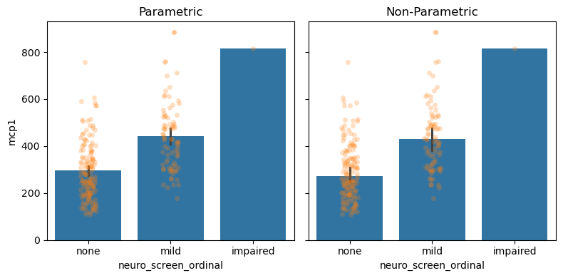
With hundreds of data points, we are very confident and precise about our estimate of the middle of the distribution.
It is important to understand the effect of sample size on spread and uncertainty. Below is a simulation that picks small subsets of the data and generates the same plot. Before you generate it; which do you think will change with sample-size and which will stay the same?
def overlapped_plot(ax, df, y = 'mcp1', mode = 'spread'):
    "Create overlapped plot with different confidence assumptions"

    if mode == 'spread':
        # Use Standard Deviation
        eb = ('sd', 2)
    elif mode == 'uncertainty':
        # Use Standard error
        eb = ('se', 2)
    else:
        raise ValueError(f'Expected spread or uncertainty, got: {mode}')

    sns.barplot(data = df,
                x = 'neuro_screen_ordinal',
                y = y,
                errorbar = eb,
                ax = ax)

    sns.stripplot(data = df,
                  x = 'neuro_screen_ordinal',
                  y = y,
                  alpha=0.25,
                  ax=ax)
NBINS = 10

BINS = np.linspace(10, len(data.index), NBINS)
fig, axs = plt.subplots(len(BINS), 2, figsize=(8, 50), sharex=True, sharey=True)

for row, sample_size in enumerate(BINS):
    print('Sampling', int(sample_size), 'samples for figure.')
    ndf = data.sample(n=int(sample_size))

    spread_ax, uncer_ax = axs[row,:]

    ## Plot with parametric assumpitions
    overlapped_plot(spread_ax, ndf, mode='spread')
    spread_ax.set_title(f'Spread: n = {sample_size:0.0f}')

    ## Plot with parametric assumpitions
    overlapped_plot(uncer_ax, ndf, mode='uncertainty')
    uncer_ax.set_title(f'Uncertainty: n = {sample_size:0.0f}')
Sampling 10 samples for figure.
Sampling 33 samples for figure.
Sampling 57 samples for figure.
Sampling 81 samples for figure.
Sampling 105 samples for figure.
Sampling 128 samples for figure.
Sampling 152 samples for figure.
Sampling 176 samples for figure.
Sampling 200 samples for figure.
Sampling 224 samples for figure.

# Which is impacted by sample size?
# answer: 'spread', 'uncertainty', 'both', 'neither'
impact_of_sample_size = 'uncertainty' # SOLUTION
grader.check("impact_of_sample_size")
So, how are the two measures impacted by sample size?
Spread : Sample size has no effect on spread.
Uncertainty : Sample size reduces uncertainty.
This type of categorical visualization is limited in that it only considers a single summary statistic. It ignores the “shape” of the data. We can use histograms to explore this.
Comparing Distributions#
Seaborn makes simple graphs easy.
sns.histplot(data = data,
             x = 'mcp1',
             hue = 'neuro_screen_ordinal')
<Axes: xlabel='mcp1', ylabel='Count'>
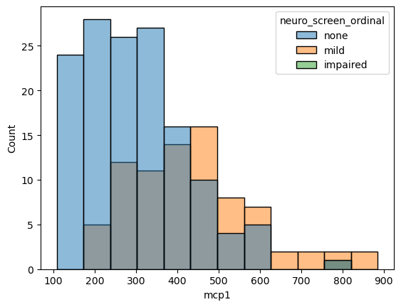
If we don’t like overlapping plots we can make it like a heatmap where the color indicates the count.
sns.histplot(data = data,
             x = 'mcp1',
             y  = 'neuro_screen_ordinal',
             cbar = True)
<Axes: xlabel='mcp1', ylabel='neuro_screen_ordinal'>
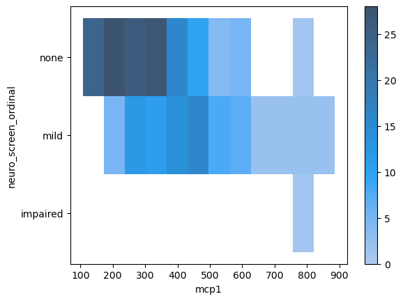
Aggregate statistic to compute in each bin.
count: show the number of observations in each bin
frequency: show the number of observations divided by the bin width
probability or proportion: normalize such that bar heights sum to 1
percent: normalize such that bar heights sum to 100
density: normalize such that the total area of the histogram equals 1
sns.histplot(data = data,
             x = 'mcp1',
             hue = 'neuro_screen_ordinal',
             stat = 'percent',
             common_norm=False) # Each group should have its own "sum to 100"
# hue_order = ['none', 'mild']
<Axes: xlabel='mcp1', ylabel='Percent'>
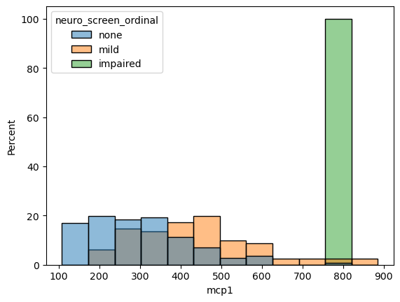
Measuring Correlation#
The previous figures measured one (or more) categorical variables and a single quantitative variable. If we want to understand how correlated any two quantitative variables are to each other.
sns.scatterplot(data = data,
                x = 'mcp1',
                y = 'tnfalpha')
<Axes: xlabel='mcp1', ylabel='tnfalpha'>
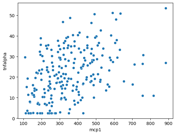
We can also use a regression plot to draw a best fit line with a confidence interval indicated by a shadow.
sns.regplot(data = data,
            x = 'mcp1',
            y = 'tnfalpha')
<Axes: xlabel='mcp1', ylabel='tnfalpha'>
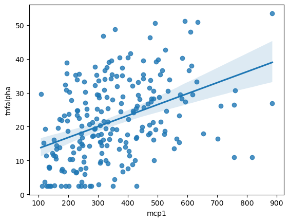
Figure Level Interface#
All of the code we’ve been running above generates a single figure. The functions below automate generating multiple figures across different facets of the data. This is an incredibly useful way to explore relationships in your data.
Categorical with catplot#
sns.catplot(data = data,
            x = 'neuro_screen_ordinal',
            y = 'mcp1',
            col = 'multi_use')

# Try:
# col_wrap = 2
# kind = 'bar', box, etc
# Other groupings across row and hue
#  Sex, isAA
#  pd.cut(data['Age'], [18, 30, 50, 100], labels=['young', 'adult', 'aged'])
#  pd.cut(data['tnfalpha'], 3, labels=['low', 'med', 'high'])
<seaborn.axisgrid.FacetGrid at 0x7f0d1f55fa60>

Each of the plots splits the data into a different categorical subset, then only plots the data within that set. Use the examples in the comments to explore ways to visualize the data.
Relational with relplot#
sns.relplot(data = data,
            x = 'tnfalpha',
            y = 'mcp1',
            col = 'multi_use')

# Try:
# col_wrap = 2
# kind = 'bar', box, etc
# Other groupings across row and hue
#  Sex, isAA
#  pd.cut(data['Age'], [18, 30, 50, 100], labels=['young', 'adult', 'aged'])
#  pd.cut(data['tnfalpha'], 3, labels=['low', 'med', 'high'])
<seaborn.axisgrid.FacetGrid at 0x7f0d1f2f3b20>

Linear model regression plots with lmplot#
sns.lmplot(data = data,
            x = 'tnfalpha',
            y = 'mcp1',
            col = 'multi_use')
# Try:
# col_wrap = 2
# kind = 'bar', box, etc
# Other groupings across row and hue
#  Sex, isAA
#  pd.cut(data['Age'], [18, 30, 50, 100], labels=['young', 'adult', 'aged'])
#  pd.cut(data['tnfalpha'], 3, labels=['low', 'med', 'high'])
<seaborn.axisgrid.FacetGrid at 0x7f0d1d5d6760>

Plotting Multiple Columns#
You’ll probably notice that all of the graphs so far have visualized a single cytokine. What if we wanted multiple cytokines in the same figure?
# This doesn't work
# sns.stripplot(data = data,
#               x = 'neuro_screen_category',
#               hue = 'Sex',
#               y = ['mcp1', 'tnfalpha'],
#               dodge = True)
I’m pd.melting#
Seaborn only plots long data. We need to convert our wide data into long data first. This is melting.
data.head()
| Sex | Age | isAA | egf | eotaxin | fgfbasic | gcsf | gmcsf | hgf | ifnalpha | ... | mip1beta | tnfalpha | vegf | cocaine_use | cannabinoid_use | neuro_screen_impairment_level | bmi | years_infected | multi_use | neuro_screen_ordinal | |
|---|---|---|---|---|---|---|---|---|---|---|---|---|---|---|---|---|---|---|---|---|---|
| 0 | Male | 53.0 | Checked | 65.01 | 170.20 | 50.32 | 117.14 | 2.51 | 481.37 | 110.79 | ... | 151.15 | 17.61 | 7.54 | True | True | none | 21 | 18 | YY | none |
| 1 | Female | 62.0 | Checked | 232.83 | 118.23 | 36.03 | 215.38 | 24.53 | 988.71 | 66.13 | ... | 230.87 | 51.22 | 31.60 | True | True | none | 22 | 16 | YY | none |
| 2 | Male | 60.0 | Checked | 84.84 | 55.27 | 13.22 | 14.08 | 0.48 | 364.31 | 78.67 | ... | 68.34 | 2.48 | 0.84 | False | False | none | 25 | 16 | NN | none |
| 3 | Male | 62.0 | Checked | 24.13 | 70.18 | 4.12 | 14.08 | 1.33 | 510.36 | 118.64 | ... | 49.15 | 10.93 | 3.53 | True | True | impaired | 29 | 21 | YY | impaired |
| 4 | Male | 54.0 | Checked | 186.98 | 69.18 | 32.56 | 184.74 | 12.55 | 395.87 | 40.79 | ... | 241.00 | 32.01 | 10.81 | True | True | none | 26 | 16 | YY | none |
5 rows × 39 columns
melted_data = pd.melt(data,
                      id_vars = ['Sex', 'Age', 'neuro_screen_ordinal', 'multi_use'], # What we want replicated across all rows of the same sample
                      value_vars = ['mcp1', 'tnfalpha', 'il6'], # What columns we want to melt into rows
                      value_name = 'concentration', # The name of the value column after melting
                      var_name = 'cytokine') # The name of the variable column after melting
melted_data
| Sex | Age | neuro_screen_ordinal | multi_use | cytokine | concentration | |
|---|---|---|---|---|---|---|
| 0 | Male | 53.0 | none | YY | mcp1 | 468.72 |
| 1 | Female | 62.0 | none | YY | mcp1 | 591.70 |
| 2 | Male | 60.0 | none | NN | mcp1 | 132.80 |
| 3 | Male | 62.0 | impaired | YY | mcp1 | 816.71 |
| 4 | Male | 54.0 | none | YY | mcp1 | 414.97 |
| ... | ... | ... | ... | ... | ... | ... |
| 667 | Male | 44.0 | none | NN | il6 | 16.69 |
| 668 | Male | 59.0 | mild | YY | il6 | 15.55 |
| 669 | Male | 63.0 | mild | YY | il6 | 11.94 |
| 670 | Male | 41.0 | mild | NY | il6 | 12.48 |
| 671 | Male | 43.0 | mild | NN | il6 | 2.40 |
672 rows × 6 columns
sns.catplot(data = melted_data,
            x = 'neuro_screen_ordinal',
            y = 'concentration',
            col = 'cytokine',
            hue = 'Sex',
            sharey=False,
            kind = 'bar')
<seaborn.axisgrid.FacetGrid at 0x7f0d1d4514f0>

Whether to use melting data and figure-level seaborn functions or using plt.subplots and then doing axis-level figure generation is a matter of personal perference and the situation.